Explain what you’re doing and why (use comments in your R code)
Briefly summarize the key finding(s) after each question
Preliminary Set-Up
Load the package
library(tidyverse)
── Attaching core tidyverse packages ──────────────────────── tidyverse 2.0.0 ──
✔ dplyr     1.1.4     ✔ readr     2.1.5
✔ forcats   1.0.0     ✔ stringr   1.5.1
✔ ggplot2   3.5.2     ✔ tibble    3.2.1
✔ lubridate 1.9.4     ✔ tidyr     1.3.1
✔ purrr     1.0.2
── Conflicts ────────────────────────────────────────── tidyverse_conflicts() ──
✖ dplyr::filter() masks stats::filter()
✖ dplyr::lag()    masks stats::lag()
ℹ Use the conflicted package (<http://conflicted.r-lib.org/>) to force all conflicts to become errors
library(sf)
Linking to GEOS 3.13.0, GDAL 3.8.5, PROJ 9.5.1; sf_use_s2() is TRUE
library(viridis)
Loading required package: viridisLite
library(gridExtra)
Attaching package: 'gridExtra'

The following object is masked from 'package:dplyr':

    combine
library(patchwork)
Import new dataset
load("data/drugwar.RData")
Research Questions
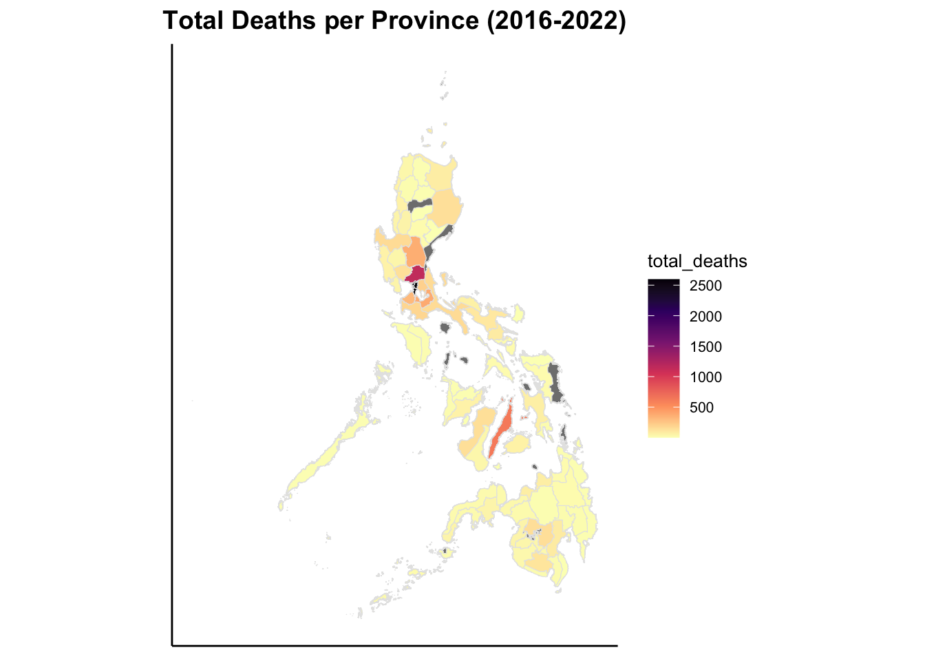
How many suspected and accused drug users and/or pushers were killed in each province in the Philippines (2016-2022)?
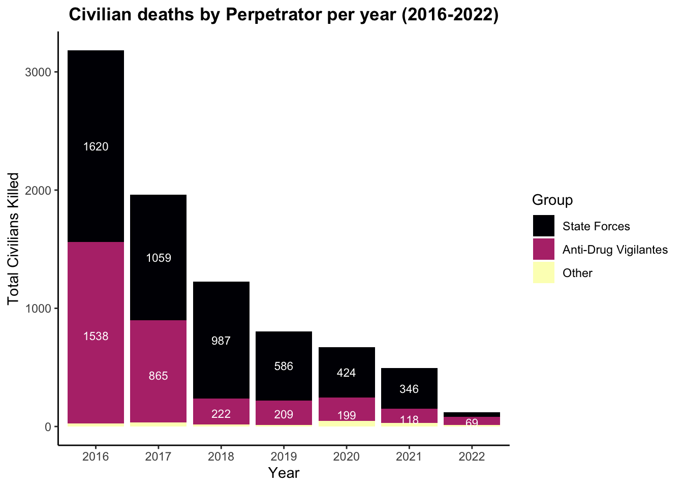
How many civilians were killed by state forces (PNP, Philippine Government, and MFP), Vigilantes, and Unknown Vigilantes?
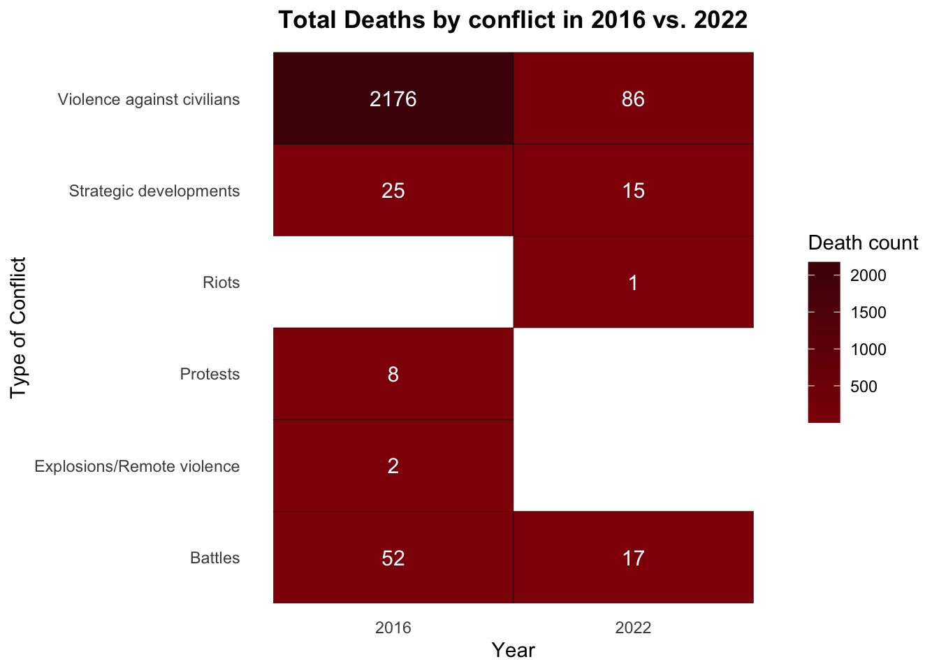
What can be observed in the types of conflict-related deaths in 2016 versus 2022?
How many suspected and accused drug users and/or pushers were killed in each province in the Philippines (2016-2022)?
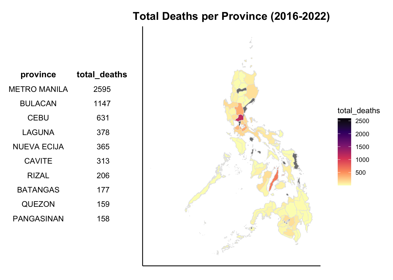
# Step 1: make a table for reference to see the top 10 provincesrq1 <- dw |>group_by(province) |>summarise(total_deaths =sum(num_of_death, na.rm =TRUE)) |>arrange(-total_deaths) head(rq1, 10)
Key findings: The death count ranges from 150+ to 2500+ killings within the six-year war on drugs, and 9 out of 10 provinces are from the Luzon island.
# Step 2: Load the data here since it will disallow you from publishing it in quartoload("data/shapefile.RData")
# Step 3: Join the cleaned version to the question and make a heat mapprovinces <-left_join(cleanersf_province, rq1, by ="province")heatmap_ph <-ggplot(data = provinces) +geom_sf(aes(fill = total_deaths), color ="gray90", size =0.2) +scale_fill_viridis_c(option ="magma", direction =-1) +theme_classic() +theme(plot.title =element_text(face ="bold", size =14, hjust =0.5),legend.title =element_text(size =10),legend.text =element_text(size =8),axis.title =element_blank(), # remove the axisaxis.text =element_blank(),axis.ticks =element_blank()) +labs(title ="Total Deaths per Province (2016-2022)")
heatmap_ph
Key findings: There are over 2500+ deaths in Metropolitan Manila alone, followed by Cebu with more than 1000 deaths. A huge portion of the deaths can be found within the Luzon island (at least from the data collected from ACLED).
Combining the table and the graph
# Step 1: Putting the needed data in a vectortable_data <-head(rq1, 10)
# Step 2: Plotting the graph and table (thank you so much, ChatGPT 'coz sorry Prof. Bin, I cannot find anything on Google)classic_theme <-ttheme_minimal(core =list(fg_params =list(fontface ="plain", fontsize =10)),colhead =list(fg_params =list(fontface ="bold", fontsize =11)),padding =unit(c(4, 4), "mm"))table_grob <-tableGrob(table_data, rows =NULL, theme = classic_theme)table_plot <-ggplot() +annotation_custom(table_grob) +theme_void() +theme(plot.title =element_text(face ="bold", size =13),plot.margin =margin(10, 10, 10, 10))combined_plot <- table_plot + heatmap_ph +plot_layout(widths =c(1.8, 3))
combined_plot
How many civilians were killed by state forces (PNP, Philippine Government, and MFP), Vigilantes, and Unknown Vigilantes?
# Step 1: Combine the rows in a vector to simplify it in the code chunk when we start grouping themstate_forces <-# this is to group all state forces togetherc("Police Forces of the Philippines (2016-2022)", "Police Forces of the Philippines (2016-2022) Drug Enforcement Group", "Military Forces of the Philippines (2016-2022)", "Police Forces of the Philippines (2016-2022) Philippine Drug Enforcement Agency", "Police Forces of the Philippines (2016-2022) Bureau of Fire Protection", "Police Forces of the Philippines (2016-2022) Special Action Force", "Police Forces of the Philippines (2016-2022) Criminal Investigation and Detection Group", "Police Forces of the Philippines (2016-2022) Prison Guards", "Government of the Philippines (2016-2022)", "Police Forces of the Philippines (2016-2022) Anti-Illegal Drugs Special Operations Task Force", "Police Forces of the Philippines (2016-2022) Barangay Tanod", "Police Forces of the Philippines (2016-2022) Special Weapons and Tactics", "Police Forces of the Philippines (2016-2022) Provincial Intelligence Branch", "Police Forces of the Philippines (2016-2022) Counter Intelligence Task Force", "CPP-NPA-NDF: Communist Party of the Philippines-New People's Army-National Democratic Front", "Police Forces of the Philippines (2016-2022) Highway Patrol Group", "Police Forces of the Philippines (2016-2022) Regional Intelligence Unit") adv <-# this is to group the armed drug and anti-drug vigilantesc("Armed Drug Suspects (Philippines)", "Anti-Drug Vigilantes (Philippines)" )other_groups <-# this is to group all unidentified groups and rest of the rows left in generalc("Unidentified Armed Group (Philippines)", "Rioters (Philippines)", "Protesters (Philippines)", "Unidentified Clan Militia (Philippines)","ASG: Abu Sayyaf", "Dawlah Islamiyah", "Maute Group", "ICC: International Criminal Court", "BIFF: Bangsamoro Islamic Freedom Fighters", "AKP: Ansar al-Khilafah in the Philippines", "NPA: New People's Army", "MILF: Moro Islamic Liberation Front")
# Step 2: String all the actors together for a cleaner and easier analysis (since not all of them have the same amount of values)all_actors <- dw |>mutate(group =case_when(perpetrator %in% state_forces ~"State Forces", perpetrator %in% adv ~"Anti-Drug Vigilantes", perpetrator %in% other_groups ~"Other",TRUE~"Unknown"))
# Step 3: Calculate the number of civilian deaths by (actor) group AND yearrq2 <- all_actors |>group_by(year, group) |># this is to group them by year and join all of the groups used abovesummarise(total_deaths =sum(num_of_death, na.rm =TRUE)) # this is to get the count of deaths by year
`summarise()` has grouped output by 'year'. You can override using the
`.groups` argument.
# Step 3.1: Calculating the total civilians killed (to be used in the bar graph)rq2 <- rq2 |>group_by(year) |>mutate(total_death_year =sum(total_deaths), # this will show the total number of civilians killed in the yearypos =cumsum(total_deaths) - total_deaths /2) # ypos puts the number inside the bar graph (google tells me this is how they get stacked)
# Step 3.2: Change the sequence of the groups in the bar graph, from highest to lowest (since the graph shows that the "other" is in the middle)rq2$group <-factor(rq2$group, levels =c("State Forces","Anti-Drug Vigilantes","Other"))
# Step 4: Plot the bar graph (with the total number per year)bargraph_actor <-ggplot(rq2, aes(x =factor(year), y = total_deaths, fill = group)) +# without the "factor()", the code will not run :(geom_bar(stat ="identity") +# the identity pulls in the calculated total abovegeom_text(data = rq2 |>filter(total_deaths >=50), # since the value in "Others" is small, we will filter it to avoid confusionaes(y = ypos, label = total_deaths), # this is to put the number inside the barcolor ="white", size =3) +# the color of the calculated numberscale_fill_viridis_d(option ="magma") +# will be using magma again to keep the colors uniform all throughout the analysis pagelabs(title ="Civilian deaths by Perpetrator per year (2016-2022)",x ="Year",y ="Total Civilians Killed",fill ="Group") +theme_classic() +theme(plot.title =element_text(face ="bold", hjust =0.5))
bargraph_actor
Key findings: The amount of killings in the first two years were relatively proportional. However, in the latter years, most of the killings are largely attributed to the state forces.
What can be observed in the types of conflict-related deaths in 2016 versus 2022?
# Step 1: Group the years (similar in second research question)years <-c("2016", "2022")
# Step 2: Calculate the total deaths by conflict in both years 2016 and 2022total_death_conflict <- dw |>filter(year %in% years) |>group_by(conflict, year) |>summarise(deaths =n())
`summarise()` has grouped output by 'conflict'. You can override using the
`.groups` argument.
# Step 3: Plot the graph using a heat map for a side-by-side comparisonheatgraph_conflict <-ggplot(total_death_conflict, aes(x =factor(year), y = conflict, fill = deaths)) +# use factor to fix the years to be displayedgeom_tile(color ="black") +geom_text(aes(label = deaths), size =4, color ="white") +# color of the text inside the box from the calculated "deaths"labs(title ="Total Deaths by conflict in 2016 vs. 2022",x ="Year",y ="Type of Conflict",fill ="Death count") +scale_fill_gradient(low ="#900D09", # changing the color to a deep navy blue high ="#4E0707") +# changing the color to blood redtheme_minimal() +theme(plot.title =element_text(face ="bold", hjust =0.5), # changing the font size and position of the titlepanel.grid =element_blank())
heatgraph_conflict
Key findings: Overall, violence against civilians take up most of the conflict pool, especially in 2016. With the last year of the war on drugs, the decline can be largely noticed.